Note: Sections of paragraph text are bolded for skimming purposes
Collaborators: Dr. Miriam Bender, Christelle Valmores, Robert Santiago, Po Hsu
Project Length: 2 months
My Role: UX/UI Designer, UX Researcher
Tools Used: Sketch App, Invision, Balsamiq Mockups
Methods Used: User Interviews, Personas, Site Mapping, Sequence Model, Affinity Diagrams, Wireframing, Prototyping, User Testing
Goals: Creating a website design for Professor Bender that captures her vision of providing a hub for CNL's to share their research and keep up with current news/events as well as an educational space where the public can learn about the position.
This project was completed for one of my courses at UCI, Informatics 172: Project in Health Informatics. This class a was a hybrid class between the fields of Informatics and Public Health. At the end of the project, myself as well as the other designer Christelle, were hired part-time by our client Dr. Miriam Bender of the UCI Nursing Department to continue our design work. The project we completed was a website design that would act as a informational hub for the Clinical Nurse Leader position as well as a library that houses CNL research and abstracts.

My team for Informatics 172
What are we trying to solve?
Currently the role of the Clinical Nurse Leader is fairly new in the healthcare community. Not much information or resources are currently available online that go in-depth about the field and share their work.
Our Solution
The goal of this project was to create an online resource that would act as a place for those who are curious about the CNL field or are trying to become CNL themselves. Additionally, in regards to CNL's we wanted to create a space where they can share their research and view others research as well as keep up with the latest events and news within the healthcare and the CNL community.
Our Process
To reach our solution, we followed a process consisting of 3 key phases: Research, Ideation, and Review & Iteration.
Research
Interviews
In our initial interview with our client, we were able to establish two types of users she wants to design this website for. These two types of users can be classified as Clinical Nurse Leaders and curious individuals seeking information about the CNL profession. These curious individuals can range from someone already in the healthcare profession or a student who's aiming to become a Clinical Nurse Leader.
After establishing our main audience , our group set out to design a set of provisional personas who would fit each description in order to better understand each individual user.


After creating our provisional personas, we wanted to see what these types of user's actually thought about making a website about CNL's. This would then help us validate the value proposition of this website which is to educate the public about CNL's as well as provide a space for CNL's to share their research. In order to do this we interviewed one CNL professional and two nursing students.

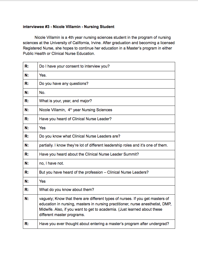
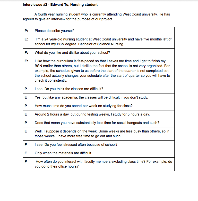
In doing these interviews, were able to gain the following insights:
1. The CNL Profession isn't very well known amongst nursing students. Though they are very curious about the field and would like to find out more.
2. CNL professionals would probably use the website as a reference and guide to help further their own research papers.
3. Websites about CNL's are very scarce especially one's that present CNL research openly for public display. The website we are creating has not really been done before and it would prove to be helpful to those in and out the CNL profession.
Data Analysis
The next step in our research process was gathering all our pre-existing data and consolidating it into data diagrams in order to thoroughly plan out the design and execution of our deliverables.
Sequence Model
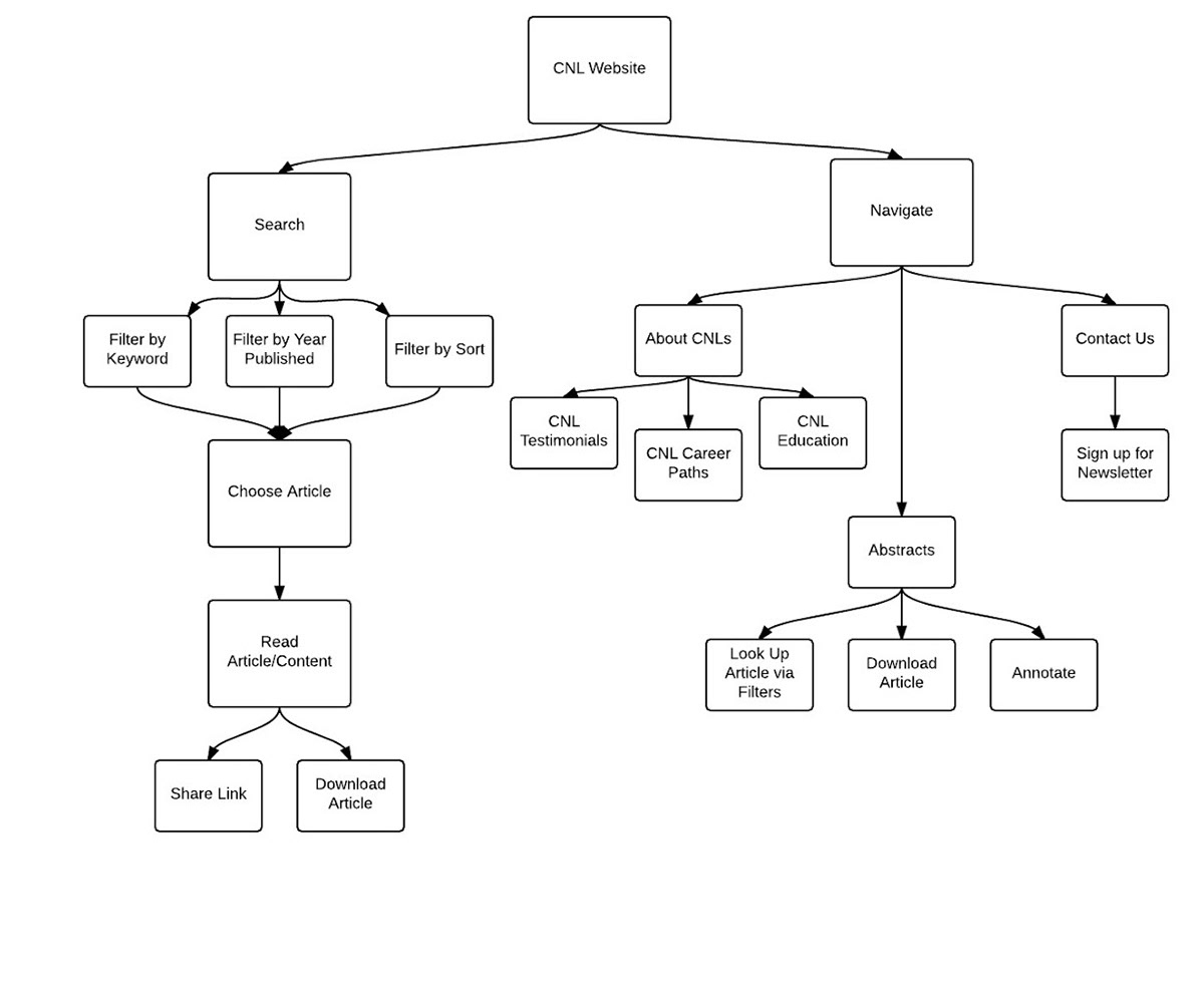
We used the sequence diagram to define the two main tasks users can perform while on the CNL website. These two tasks include searching for research abstracts and navigating the website to find specific information. Our sequence diagram laid the foundation for the creation our site map.
Site Map
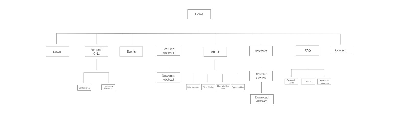
Creating a sitemap helped us establish what pages were going to be present within our website. Also it helped us organize where certain information would be displayed. This in turn made our design easier to execute.
Affinity Diagrams

We used the affinity diagram as a way to sort the compilation of our research into organized categories. The affinity diagram was based on our two deliverables for this class which was a website design and a system to categorize CNL Abstracts. For the website design, it was really useful to organize our data into categories that defined the look of the website and the desired functionalities user's want.
Ideation
Wireframing/Prototyping
Using our research to fuel our design, we created our wireframes through Balsamiq Mockups to present to our client for review.

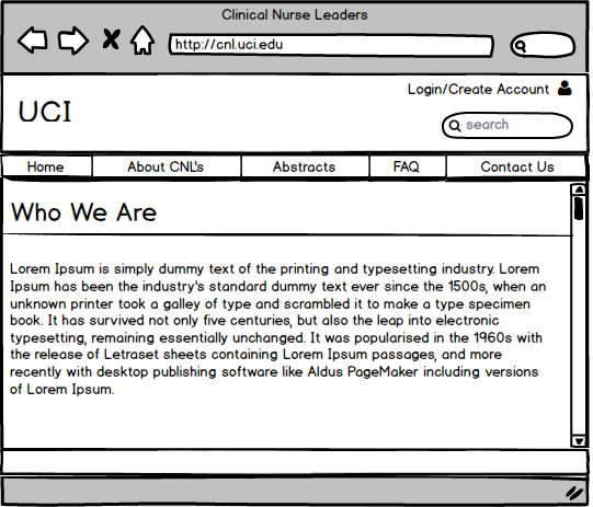
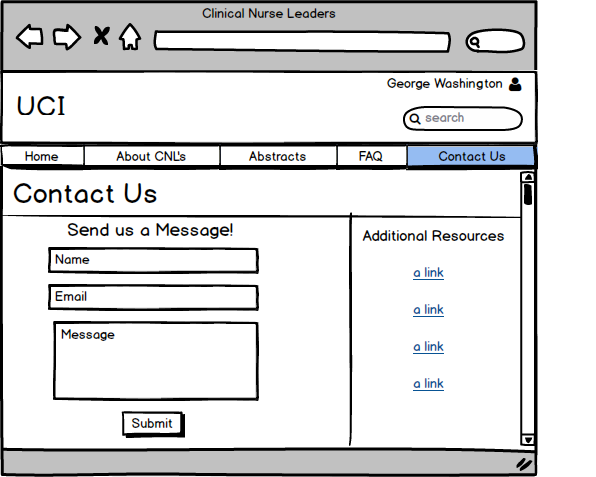

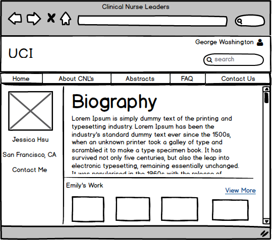


After getting an approval from our client, we translated our wireframes into a higher fidelity using Sketch. This was our first time using Sketch so we gained the inspiration for the design from tutorials we saw and from medical websites we looked up on the Google. Overall our professor and client were pleased with the aesthetic.
This is the final design we delivered for this class.

CNL Homepage & About Page
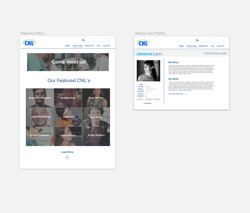
Featured CNL's & CNL Profile

Abstract Search Page
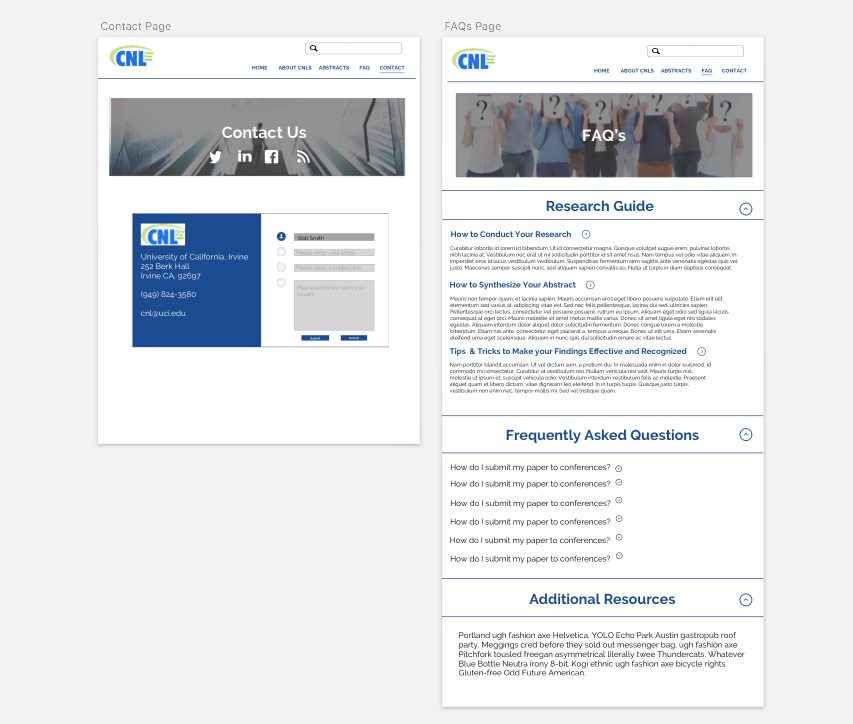
Contact and FAQ Page
Review & Iteration
Christelle and I were hired to continue this design project a month after we completed our class. In meeting with our client again, we decided to improve our overall design. Even though our initial design was good, we believed we could do better as we were able to improve our abilities in Sketch. Our client agreed she wanted a more modern aesthetic and worked with us to improve our design.
In the second iteration of our design, we not only improved the overall aesthetic but we were able to create designs for the website in mobile and tablet sizes as well. Sadly, our part-time project ended before we could further implement our designs and do testing.
Here's what we were able to create in our next iteration:
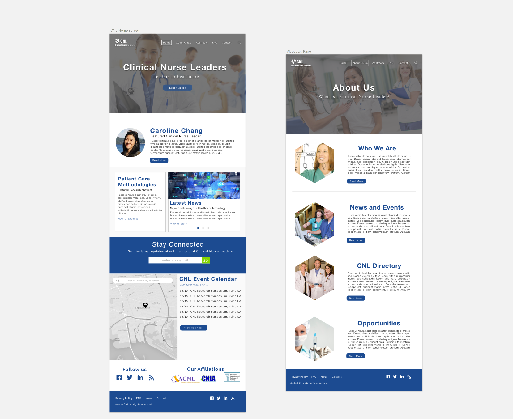
CNL Home Page & About Page

CNL Directory & CNL Profile
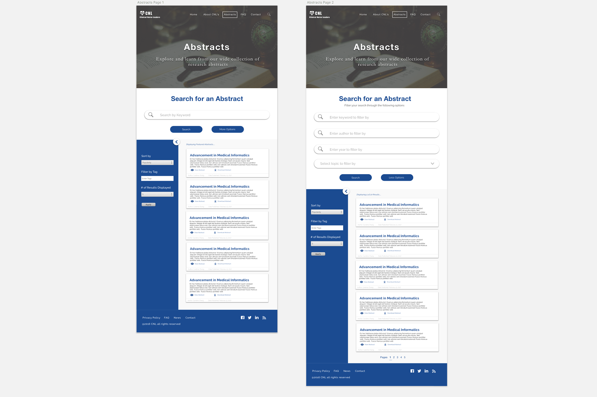
Abstract Search Page

Contact and FAQ Page


Tablet and Mobile Versions
One Year Later..
A year later I took this project up again as personal project and chose to create a new iteration. In order to help drive a new design of the CNL website, I chose to test my previous design in order to gain feedback of what I can improve on. I did this by creating an Invision prototype and asking a couple friends to go through usability tasks as well as letting them voice their opinions on how to improve the site.
Prototype Link:
From doing testing I gained the following feedback for improvement:
1. If a section has a link to multiple sections, it would be nice to have a drop down menu when hovering over the section in the header.
2. You should provide all external links to pages on the site in the footer for easier navigation.
3. For the CNL directory, it would make your prototype more believable if you used pictures of professionals in their field.
4. For the CNL directory, it would help to see where each CNL is based out of and what their research specialities are from viewing their search overview.
5. Try to make the abstract search similar to searching an educational database or Google. It's a more familiar interface.
6. Users don't immediately download a abstract just from seeing it in the results. They scan it then download it.
In taking these suggestions in consideration, I created a final iteration that reflects these insights and my growth in ability as a Web designer.
Here is the final design:


Conclusion
Next Steps
The second iteration of this design was the final design handoff I gave to my client and the third iteration was more for a personal project. I don't currently know if she continued the design project to development but I am considering sending my old client the new design just for old time's sake.
Retrospective
Looking back to when I first started this project and seeing where I am now, its crazy how much better and more confident of a designer I became. When I did the initial design for this project, it was my first time designing a website and using Sketch. I thought I was going to fail at making the design and I was really scared the client would not like it. Thankfully our client was understanding and pushed me and Christelle as designers.
Lessons Learned
In doing this project, the two biggest lessons I learned were:
1. If you've never done something before and you're scared of failing, just do it anyways. The learning experience will make you grow in the long run and you might be surprised at what you can do with just a little hard work.
2. It's nice to take a look back at older projects you liked and re-develop them to reflect a greater skill or a greater understanding of the problem. It helps you see things you missed and what you could've done better.